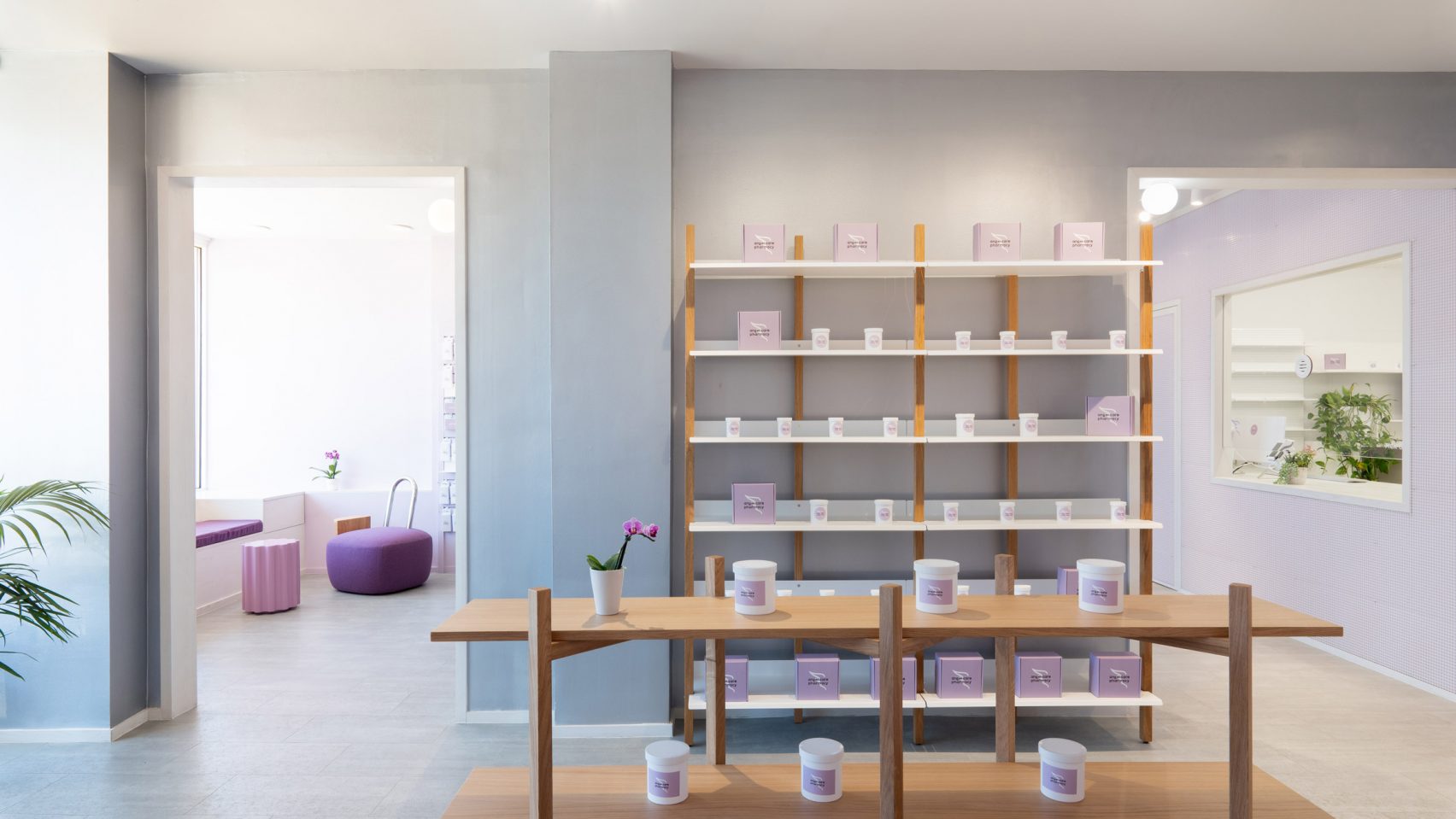
Brooklyn-based designer Sergio Mannino has chosen a palette of purple and silver for a Philadelphia pharmacy that helps patients affected by the opioid crisis.
Located in the Philadelphia suburb of Cheltenham, the Angel Care Pharmacy is owned by Olivia Tchanque, who wanted the design of her space to reflect the care and sensitivity offered to her patients.
Tchanque looked to Sergio Mannino Studio to create an environment that feels distinctive, clean and contemporary.
The pharmacy was born in part to help deal with the ongoing opioid crisis in the US, and those with addictions to OxyContin and deadly substitute Fentanyl.
Its mission revolves around “providing the community with the best medical supplies and care they need”, said Tchanque.
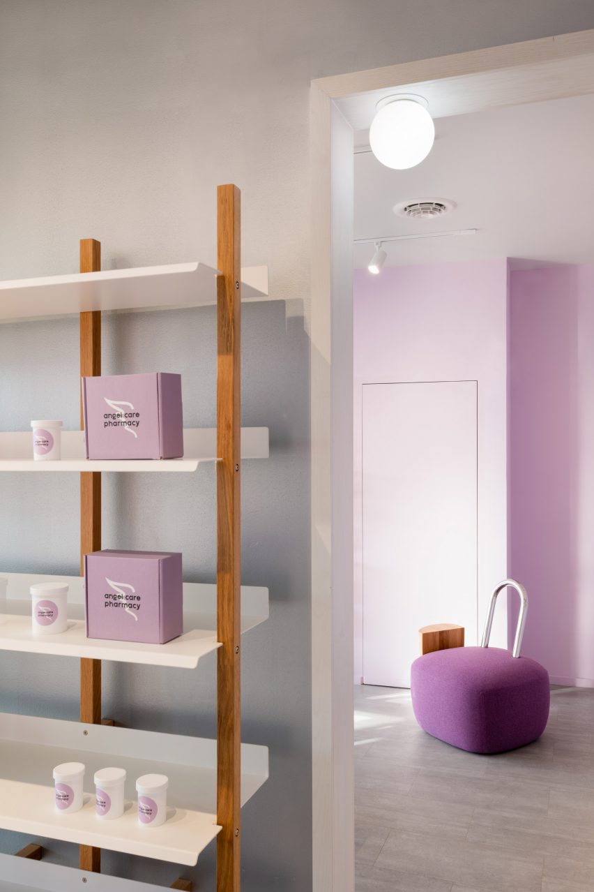
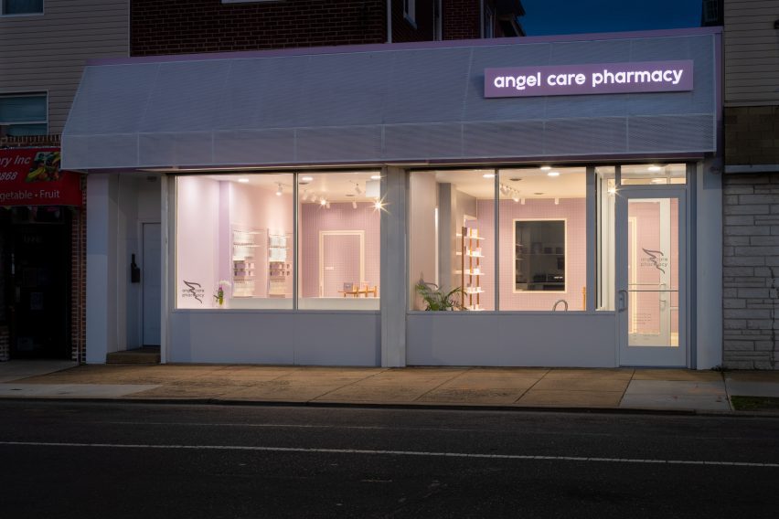
Mannino was responsible for the interior design and branding for the space, including its angel-wing logo used for signage and across marketing materials.
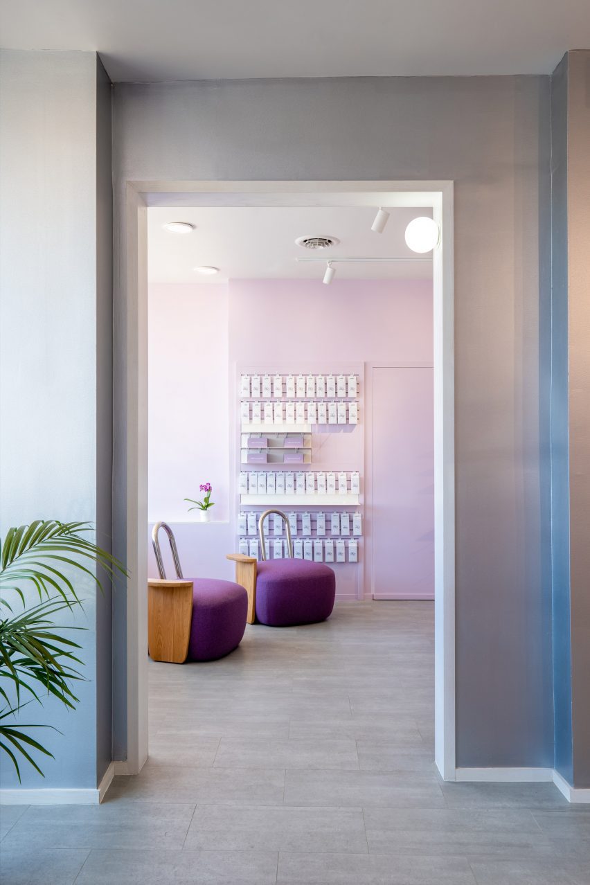
Once two separate units, the 1,800-square-foot (167-square-metre) pharmacy is divided into retail operations and prescription areas now connected by an open doorway.
In the retail area, the designer intentionally chose colours that are bold but would not be overbearing.
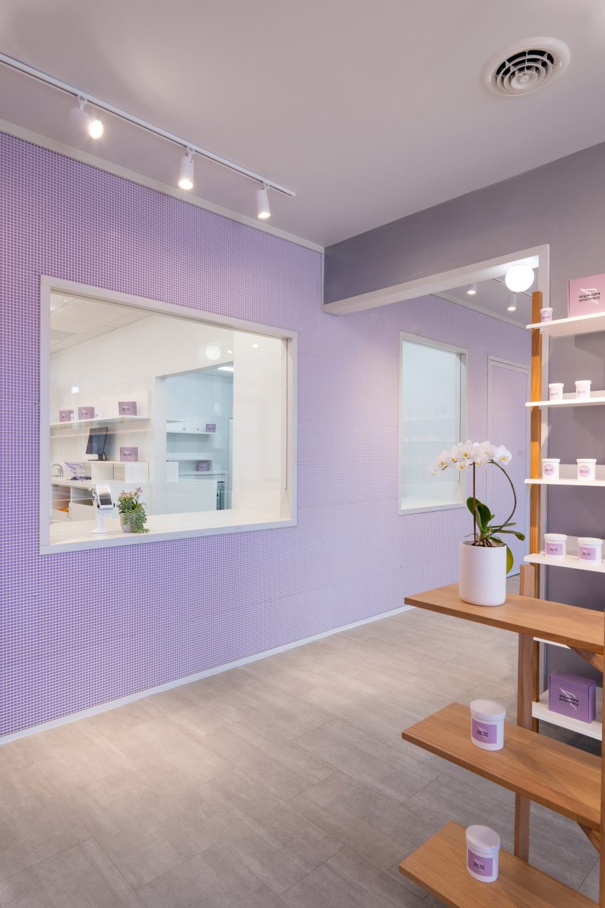
“Mauve is the colour of balance: it represents tenderness and it’s frequently associated with femininity and motherhood,” said Mannino.
“White brings a feeling of safety and purity. It represents the absence of things and a sense of relaxation and clarity. Silver has always been associated with the moon, inspiring a feeling of joy and peace.”
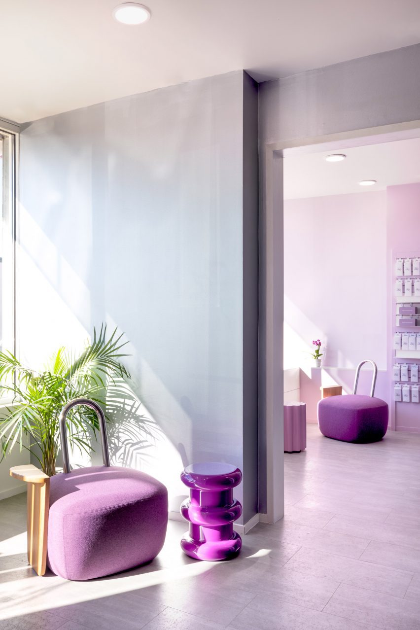
Two chairs designed by Mannino with soft purple-upholstered bases, minimal chrome backrests and oak armrests provide a waiting area for patients along with a built-in window seat.
These are accompanied by two side tables designed by Ettore Sottsass for Kartell, in violet and pink finishes.
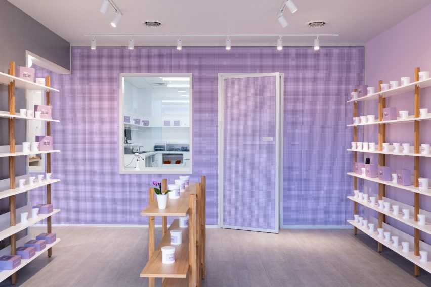
The room is decorated with silver-toned wallpaper on two sides and purple grid pattern on the others.
Shelving displays along the walls came from Blu Dot, while freestanding units in the centre of the room are by Hem – both crafted from oak.
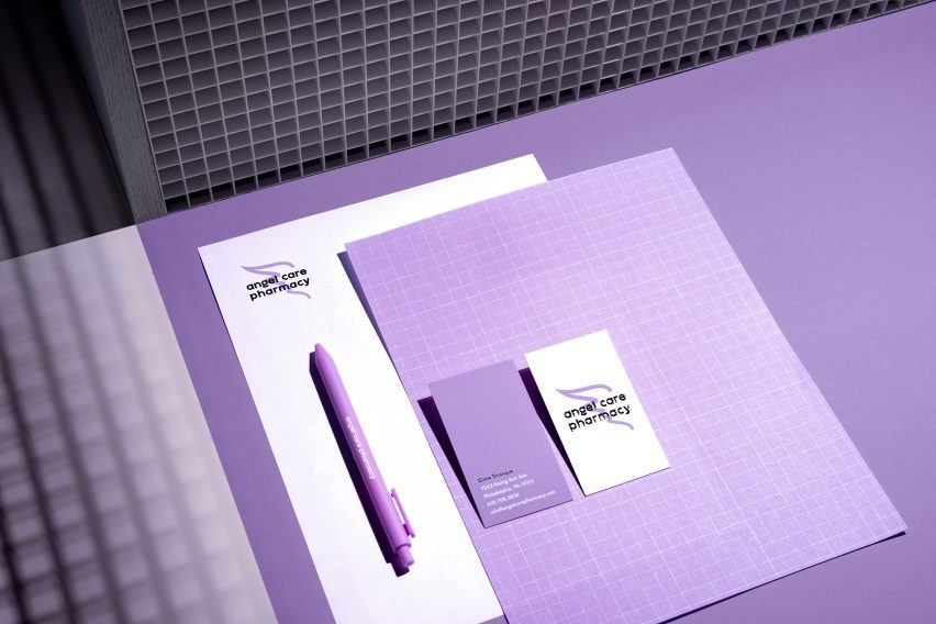
The colour palette extends to the minimalist branding, which features mauve hues, grid patterns and contemporary typography.
At Tchanque’s request, Mannino also introduced compostable vials and bags instead of plastic packaging, since “every year, each local pharmacy in the US fills 60,000 prescriptions on average,” according to the pharmacist.
Sergio Mannino Studio was established in 2008, and the firm’s early projects included a showroom for footwear brand Kensiegirl and another shoe shop where the walls were covered in interchangeable panels.
More recently, Mannino completed a pharmacy waiting room in Brooklyn featuring graphic floor tiles, a pigmented cement desk and curved leather chairs.
Source: https://www.dezeen.com